

Flexfit is a B2B headwear brand, one of the most recognized in the industry, that supplies blanks and custom hats to retailers, distributors, and brand partners worldwide. Unlike a direct-to-consumer site, Flexfit.com isn't optimized for checkout. It's optimized for decision-making, helping wholesale buyers evaluate products, understand technology differentiators, and find their way to the right purchasing path.
The problem: the site wasn't doing that job well. I was handed this project by Creative Director David Kim with a clear mandate: evaluate the current site, identify what's working and what isn't, and propose a direction forward. I owned the research, analysis, and design end to end.
Flexfit’s digital experience had become fragmented, with two disconnected online systems creating confusion for users trying to browse products, understand brand offerings, and move efficiently through the customer journey.
As a Designer, I led the restructuring of the website’s navigation and information architecture to unify these separate experiences into a single, more intuitive system. Using user behavior analysis and Google Analytics, I identified friction points causing unnecessary drop-off and mapped a clearer pathway for product discovery and engagement.
By simplifying navigation hierarchy, improving landing page clarity, and reducing decision fatigue across the browsing experience, the redesign created a more seamless user journey that better supported both customer understanding and business goals.
This contributed to measurable performance improvements, including an 11.9% reduction in bounce rate and a 20% increase in pages per session, while creating a stronger foundation for long-term digital growth and conversion optimization.
Flexfit.com Website Evaluation & Navigation Redesign
Understanding Who's Actually on the Site.
Before touching anything, I needed to understand who Flexfit's web audience actually was. Not assumed personas, but data-backed profiles.

Using GA, it became clear that Flexfit's audience skewed toward business professionals in the fashion and lifestyle space, concentrated heavily in the United States with meaningful international presence. The data painted a picture of a savvy, research-oriented buyer. This was someone evaluating product lines, comparing technology specs, and making purchasing decisions on behalf of a business.
I immediately flagged usability tension: the existing site was structured more like a consumer retail experience than a B2B product catalog.
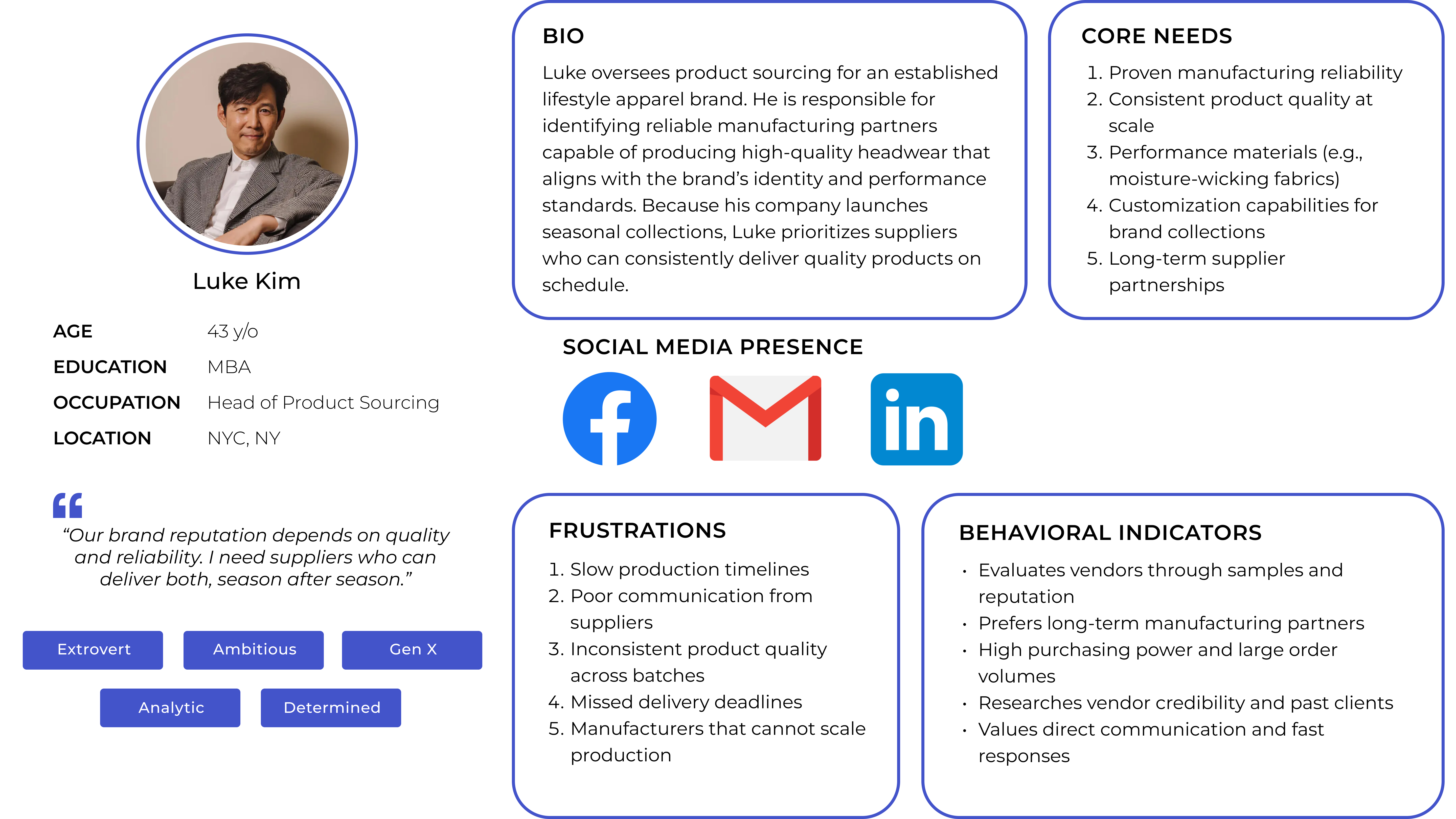
Three distinct buyer profiles emerged from the data.
These three personas share a core need: clarity. They need to quickly understand what Flexfit makes, how it differs from competitors, and how to start working with them. The existing site structures weren't facilitating a seamless experience on these fronts.


Mapping the first-time customer experience from discovery to purchase.
The journey map below traces a first-time B2B customer attempting to purchase hats through Flexfit's site, revealing where neutral frustration quietly compounds into a genuinely broken experience by the time users hit checkout.

Diagnosing the Current Site Structure.

The most immediate structural issue: Flexfit was running two separate sites, Flexfit Main and Flexfit Shop, with overlapping but inconsistent navigation, redundant pages, and unclear logic for why certain content lived where it did.
For a buyer trying to move from product discovery to purchasing, this created a fractured experience. The behavior flow data from Google Analytics confirmed it: users were dropping off at navigation decision points, unable to find their way through the catalog efficiently.
What the data showed.
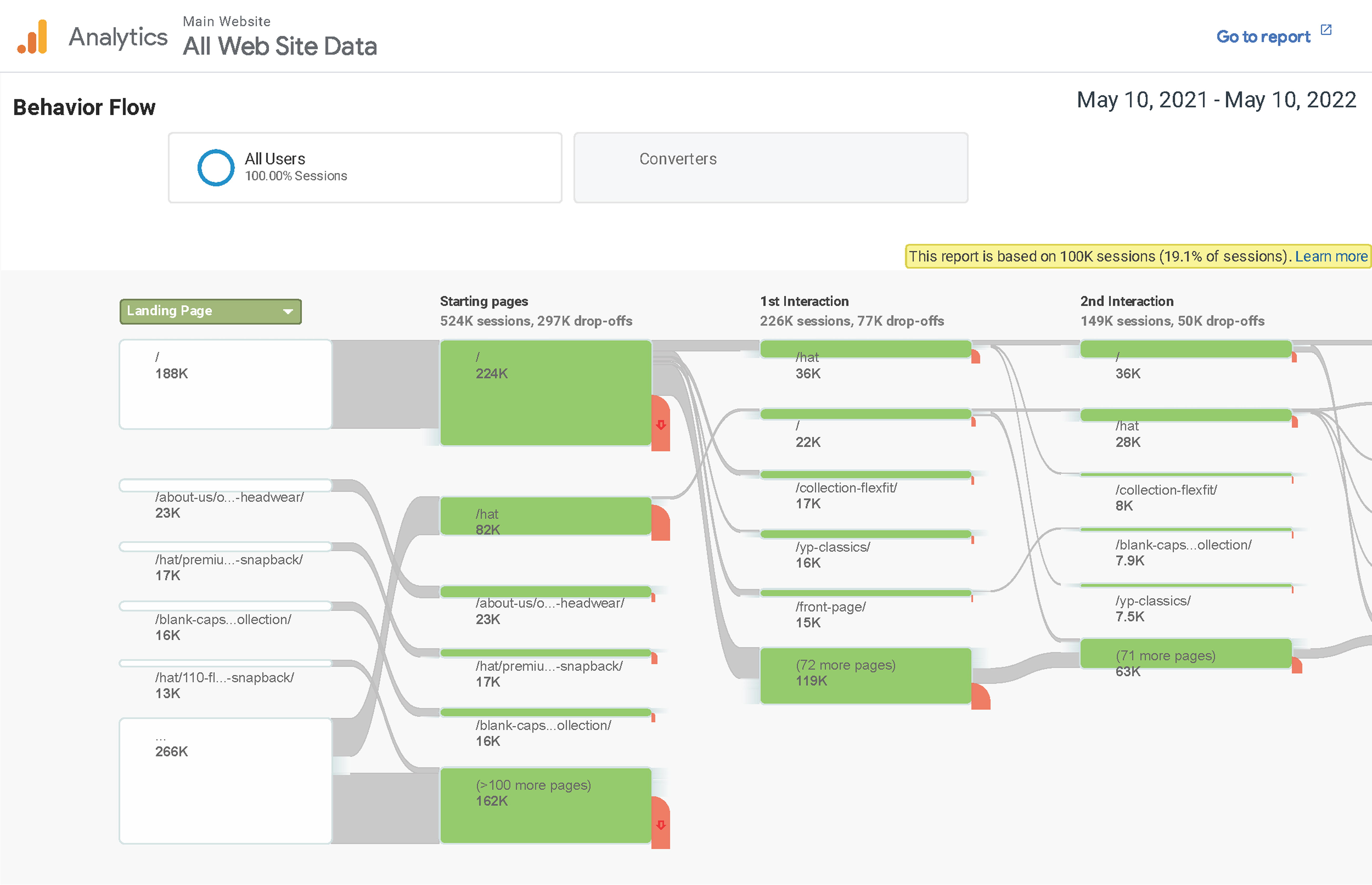
Key signals from the pre-redesign analytics:
The data reinforced what the personas suggested: high-intent users were getting lost.
Who else lives in this space?
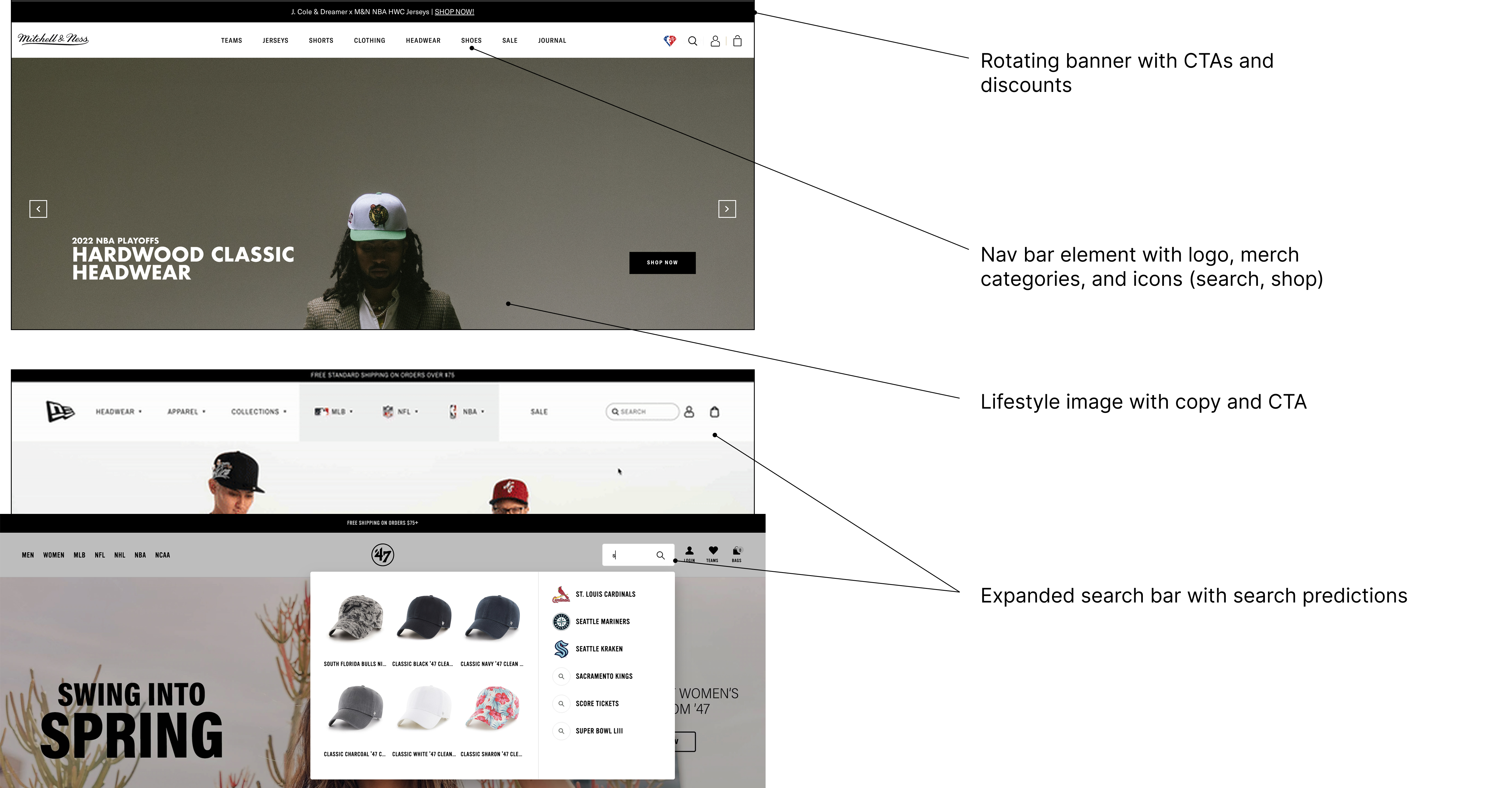
I benchmarked against direct competitors (47 Brand, Mitchell & Ness, and especially New Era) operating in the premium headwear space with overlapping wholesale and retail buyer audiences.
Key observations:
Flexfit's site, by contrast, led with technology naming conventions (FlexFit, YP Classics, FlexFit 110) that were meaningful internally but opaque to new buyers.
Product Description Benchmarking.
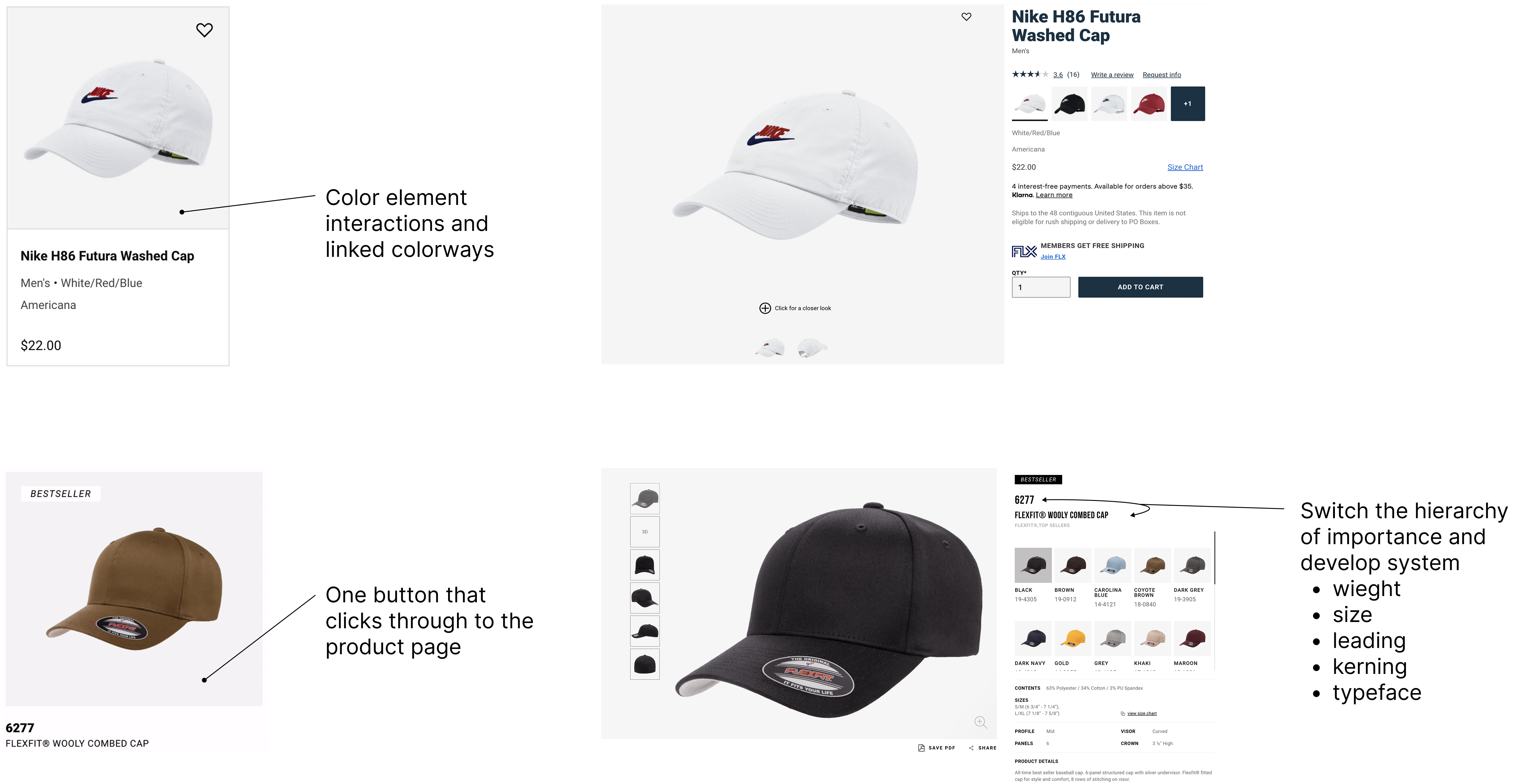
Nike's product pages set the bar for how to communicate product attributes at scale: clear hierarchy, consistent formatting, a single "add to cart" button that flows through to the product page, with weight, origin, sizing, and technology information structured and scannable.
Flexfit's product descriptions lacked this consistency. Information architecture varied across product lines, and key decision-making attributes (material, fit, size range) were buried or absent.
Rethinking the information architecture.
Flexfit was running two separate sites with overlapping and inconsistent navigation, buyers had to figure out which site they needed before they could even start browsing. The goal was straightforward: consolidate both into a single experience, remove the redundancies, and build a structure around how buyers think rather than how Flexfit names its products internally.
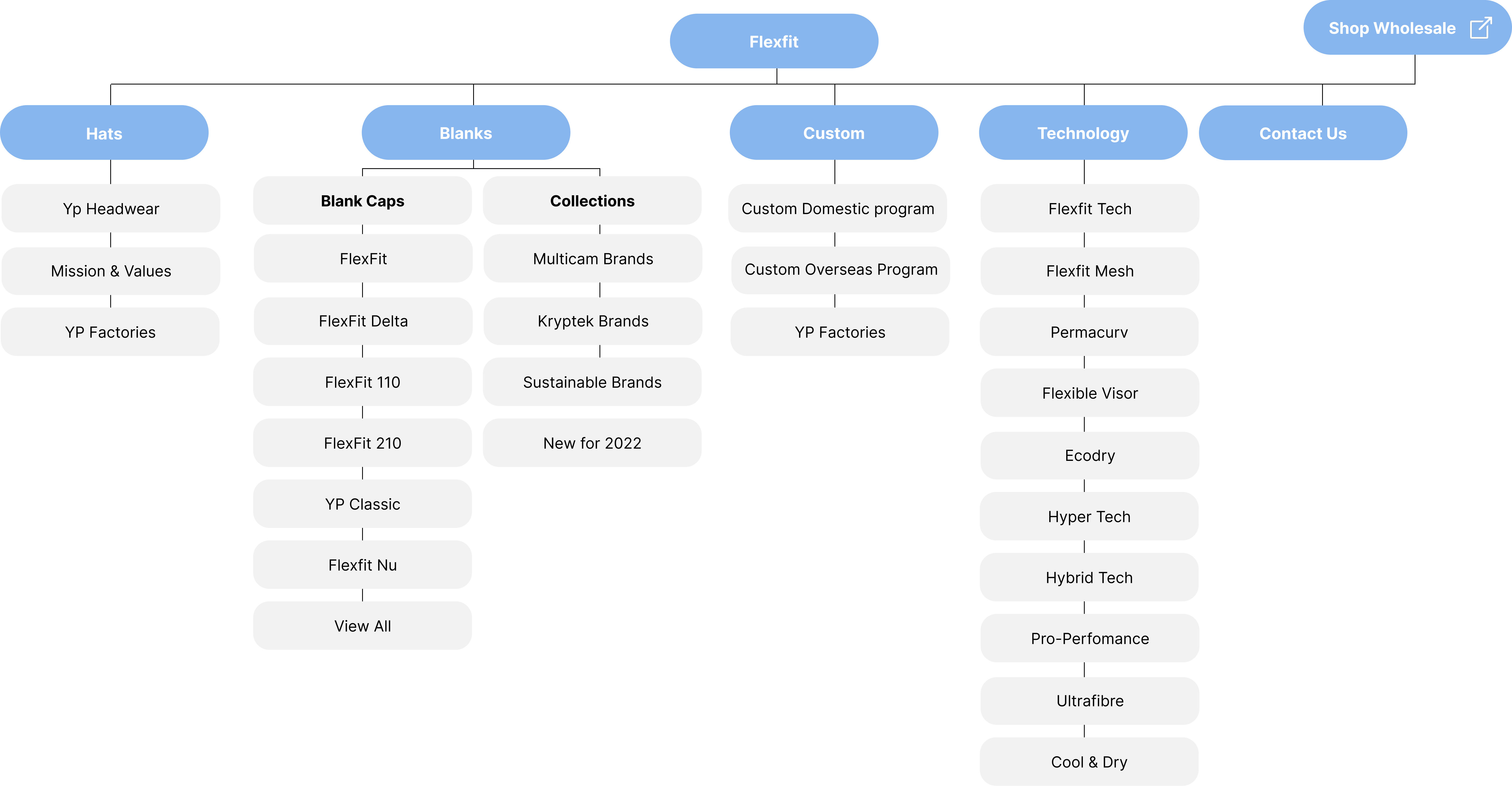
Key moves:
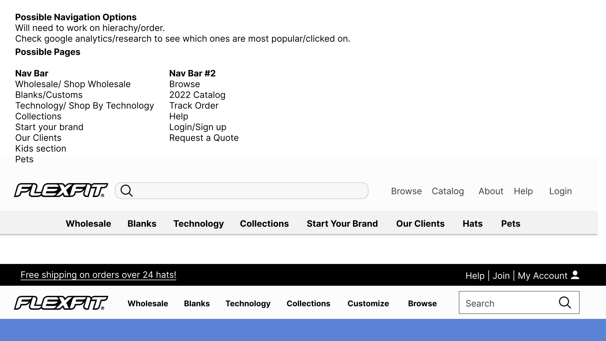
Ideation
I explored two nav bar structures: #1) prioritizing B2B product pathways, and #2) leading with utility links (Catalog, Track Order, Request a Quote).
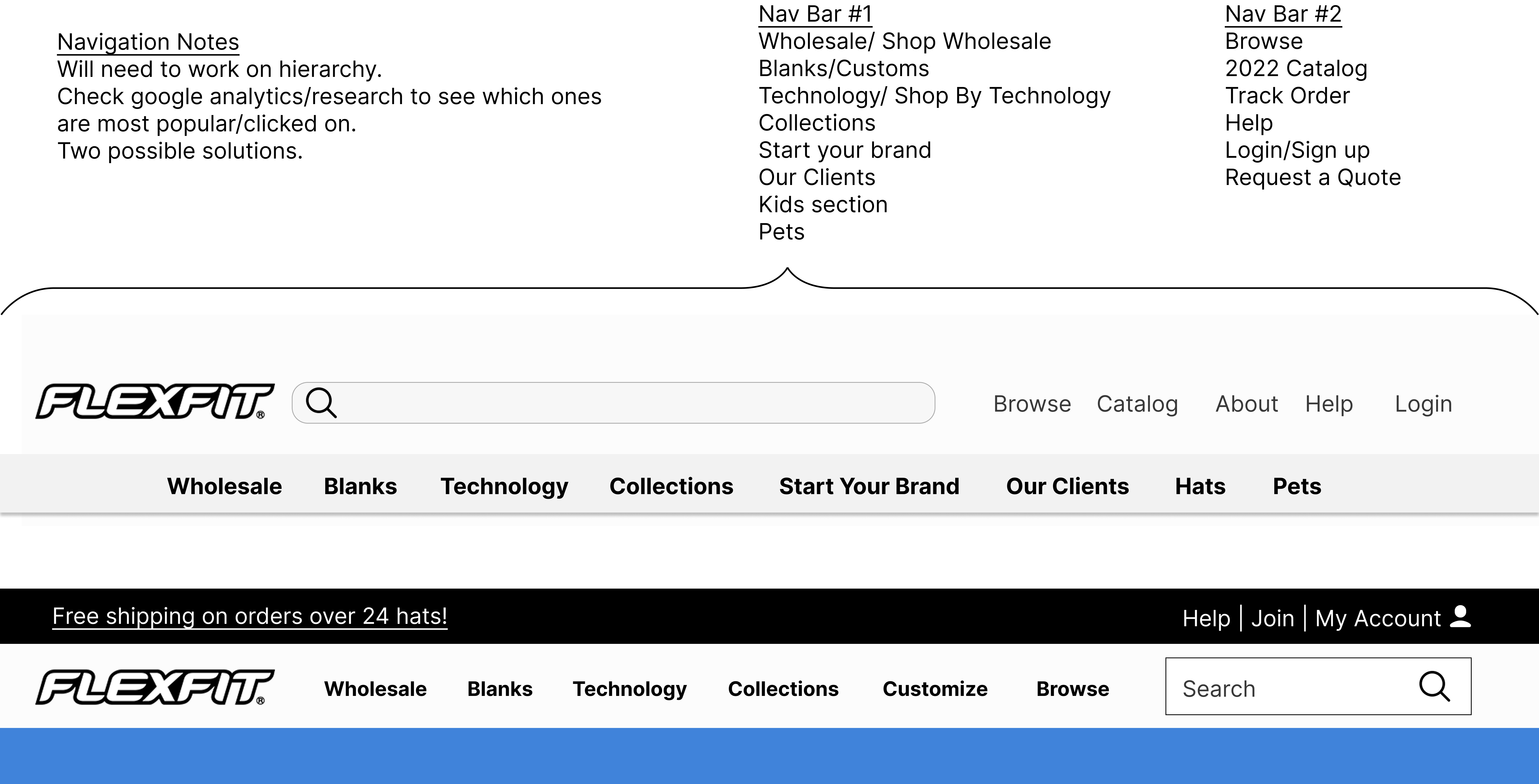
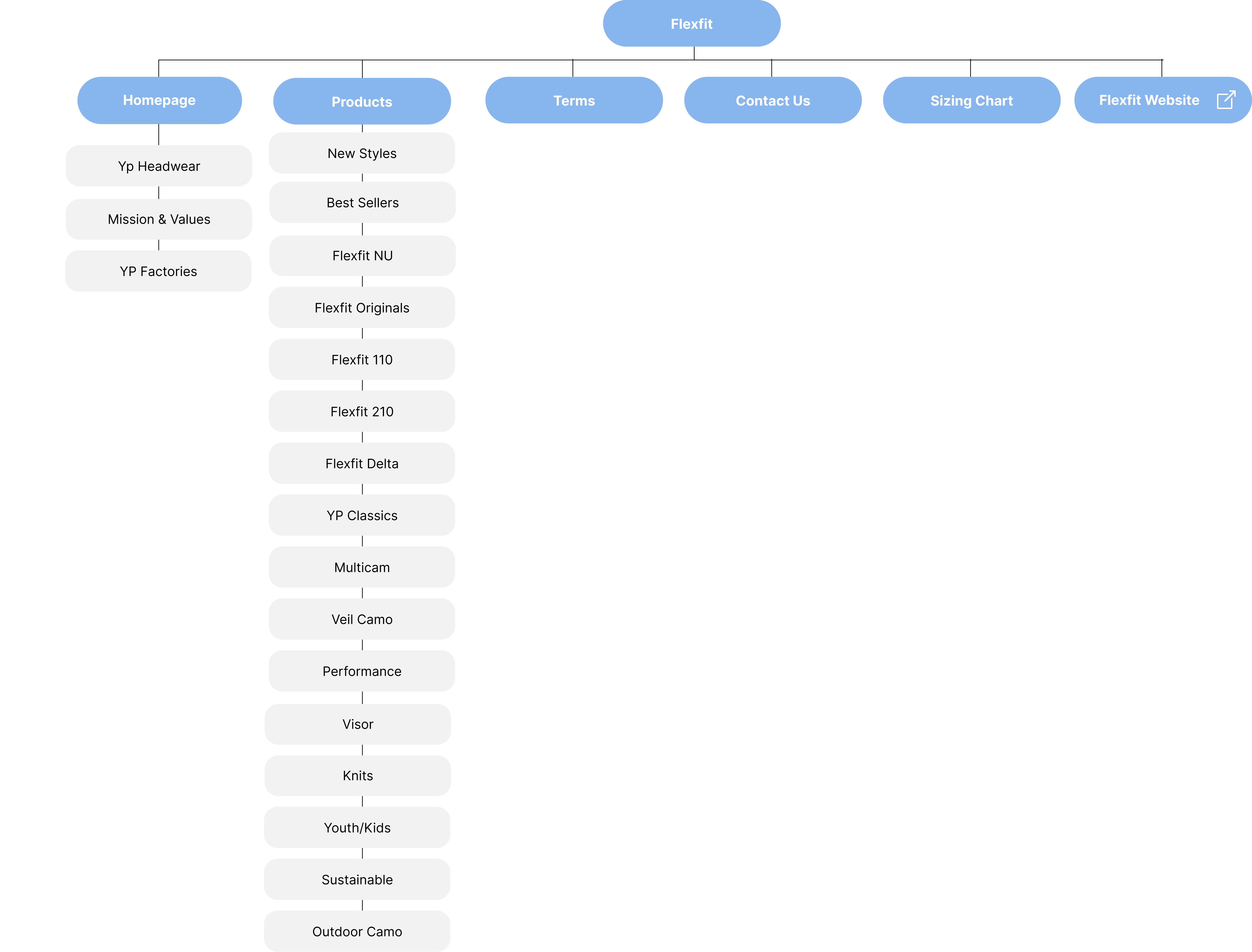
The Final Navigation
The shipped nav organized the Hats dropdown across multiple entry points (by demographic, activity, popular styles, brands, technology, and hat size). A buyer no longer needs to know that "FlexFit 110" is a low-profile fitted cap to find one. They could start from what they know, a sport, a customer demographic, a style, and navigate to the right product from there.
Click for drop down:
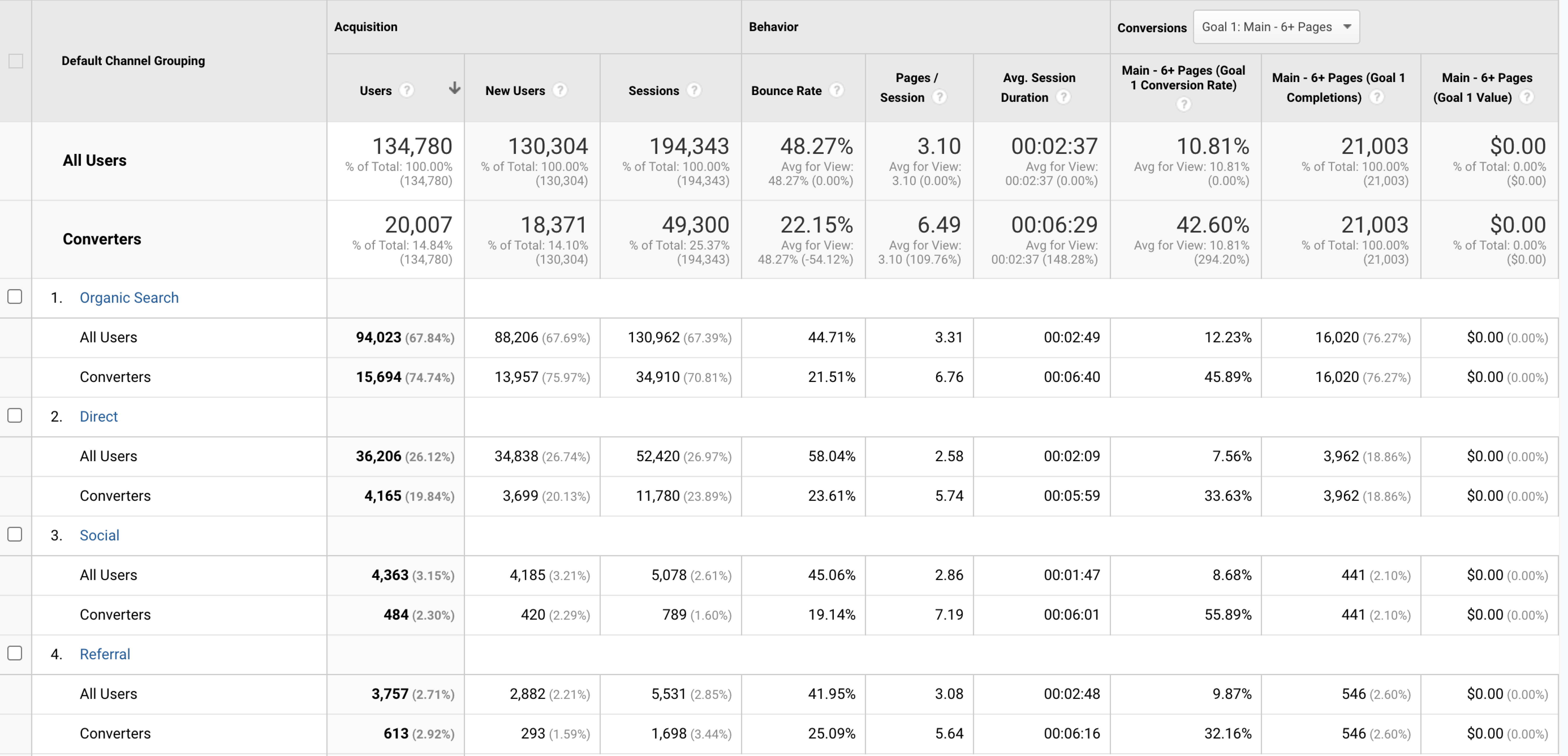
Measuring the Impact.
The redesigned navigation shipped and the numbers reflected the structural improvement. Analytics pulled from Google Analytics post-launch showed meaningful changes in how buyers were moving through the site.
For a B2B site where the goal is informed decision-making, not impulse purchase, session depth and time-on-site are the metrics that matter. Buyers who stay longer and explore more pages are buyers who are building confidence in the product line. The redesigned navigation removed the structural friction that was cutting those sessions short.
This project was an early proof-of-concept for how I work: start with the data, pressure-test assumptions against real user behavior, and let competitive context inform design decisions rather than personal preference. The Flexfit nav redesign also clarified something I carry into every project now, B2B UX is underrated.
The stakes are high (wholesale decisions aren't impulse buys), the users are sophisticated, and the design has to earn trust through clarity, not charm. Getting that right required the same rigor as any consumer product, just applied differently.